For your pick
Kate's brand ideas
Kate went through the brand page. Here are her ideas, each one beside what the site has now, on a light screen and a dark one. Kate has seen them, and her take is under each. Chris picked on Nov 11: A, B (the rugged rectangle), C, D1, D2 and F are now live, and Amplify Hope stays as it is. The Now column shows the logos as they were.
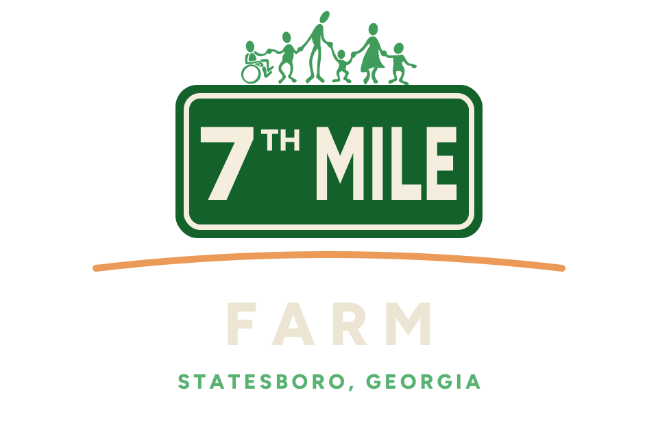
A. Darker greens
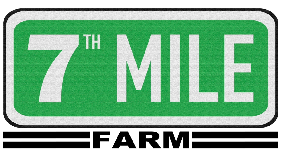
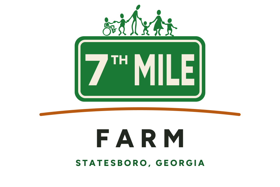
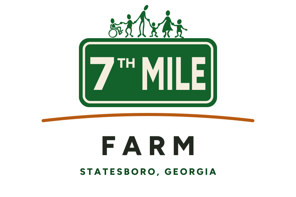
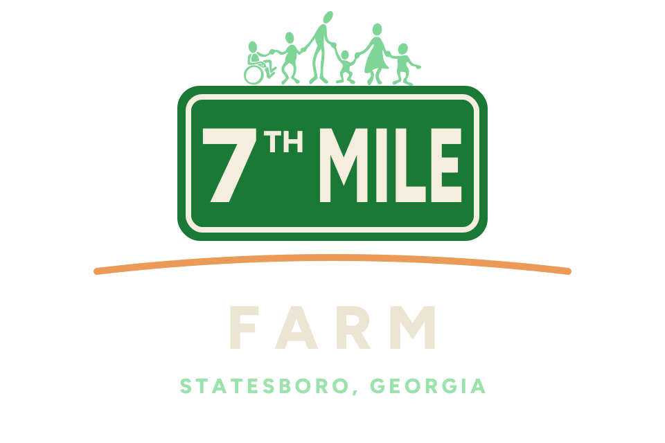
Kate finds the greens minty, most of all on a dark screen, and would make every green a shade darker, closer to the green the ministry has always used. The 7th Mile sign shows the original green beside today's.
Kate, after seeing it: "I love the colors on all of those."
Light screen
Dark screen
Light screen
Dark screen
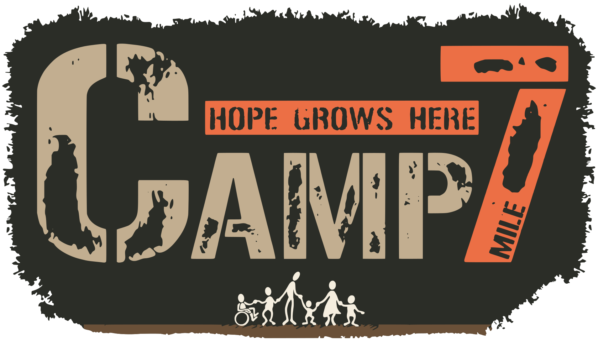
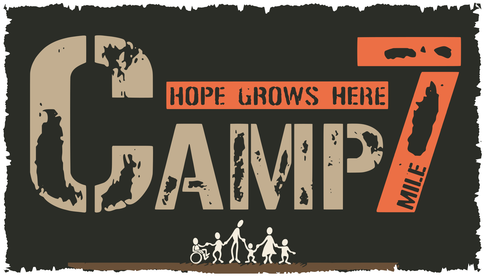
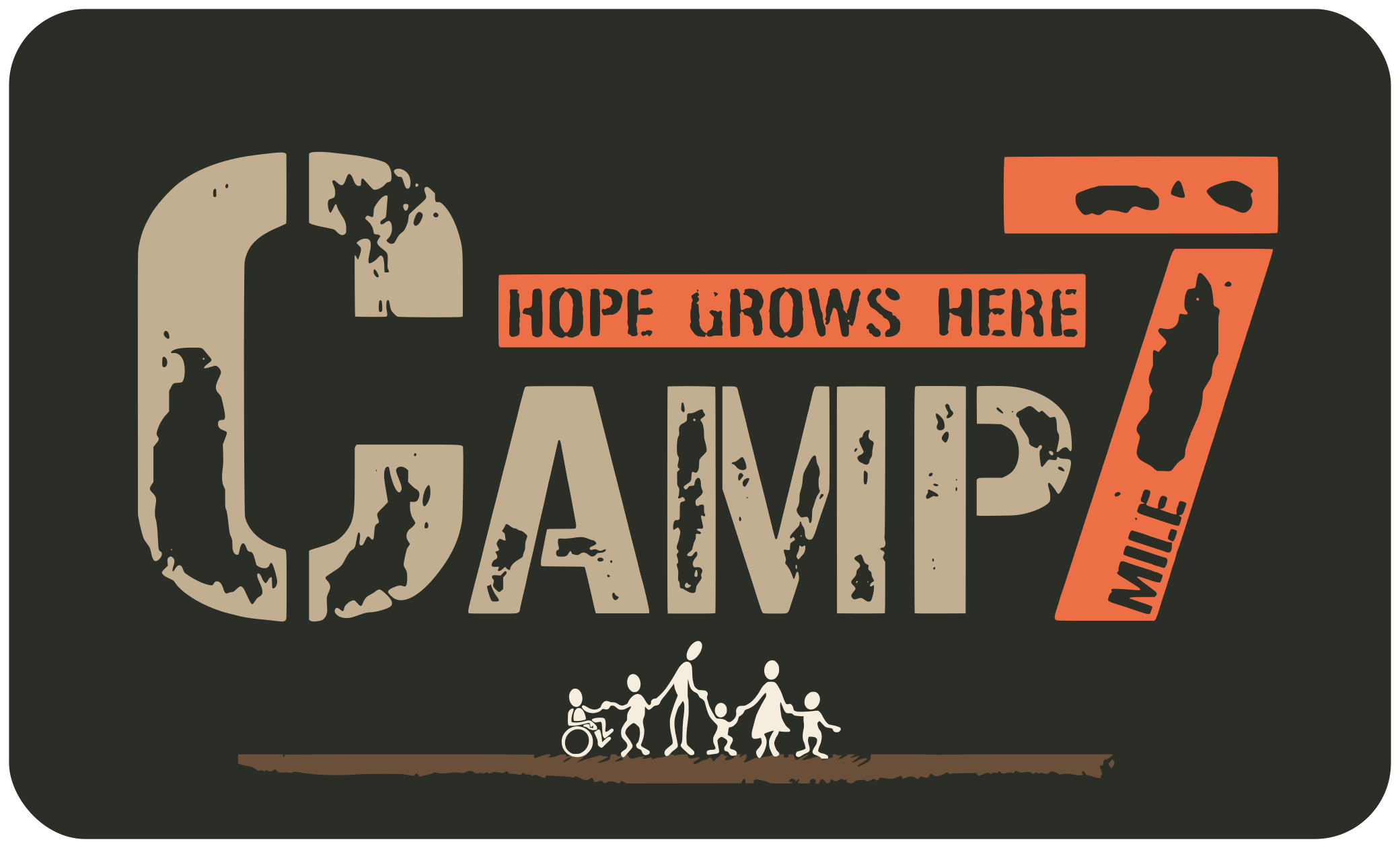
B. Camp7 patch, two shapes
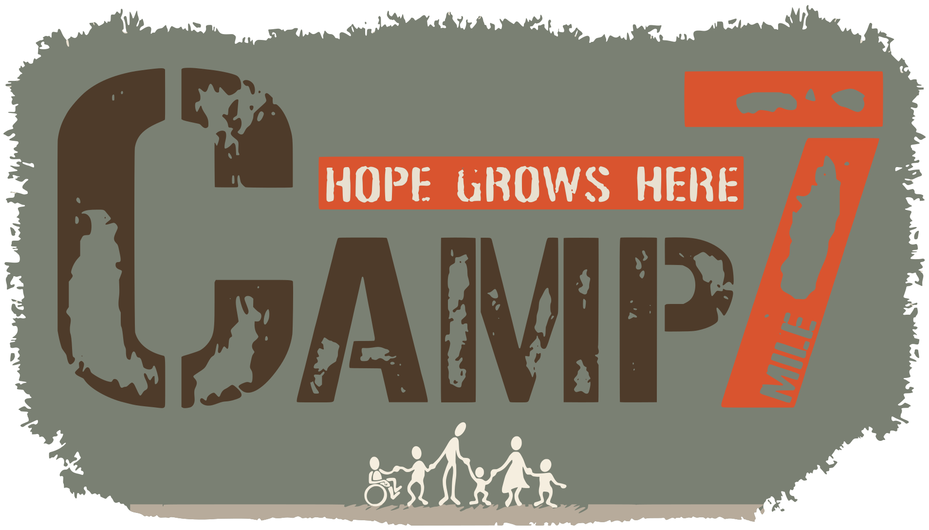
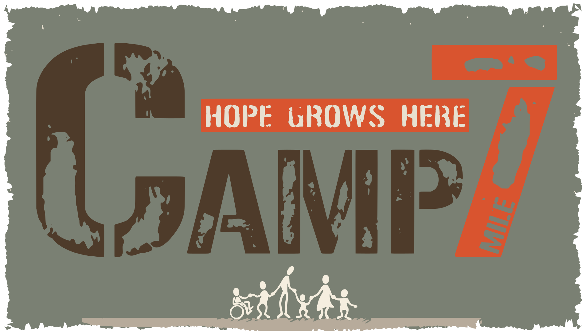
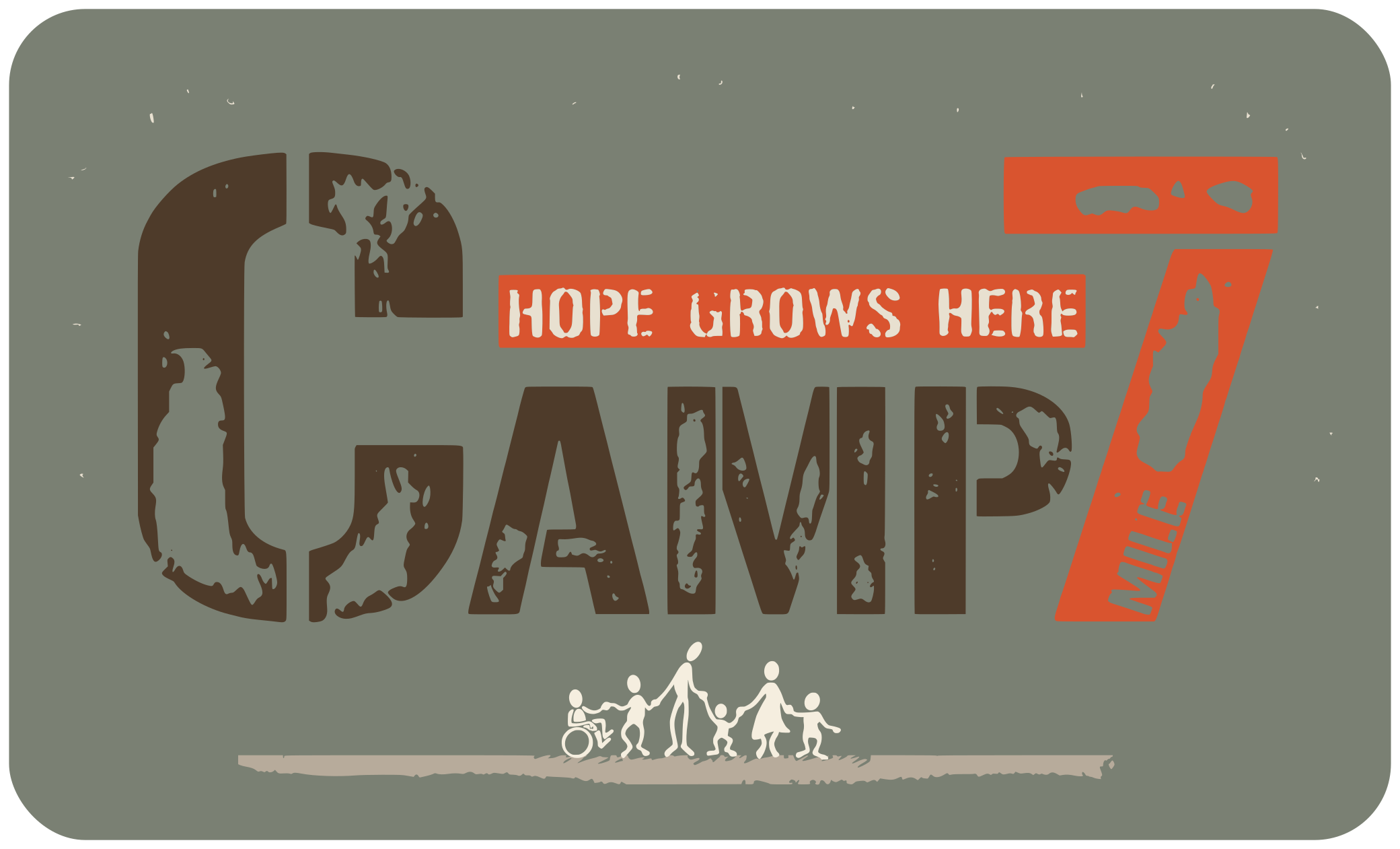
Kate feels the rough patch makes camp look like boot camp, and the clipped bottom corners don't fill out. After seeing our first try, she asked for the rugged edges with the corners pulled all the way out, more of a rectangle. Or, if the corners are rounded, more room between the logo and them. Both are here. The words stay their current size. She loves the version without the patch; it stays as it is.
Kate, after seeing both: "Looks SO good! LOVE the rugged rectangle."
Light screen
Dark screen
C. The coast camp's words in its blue
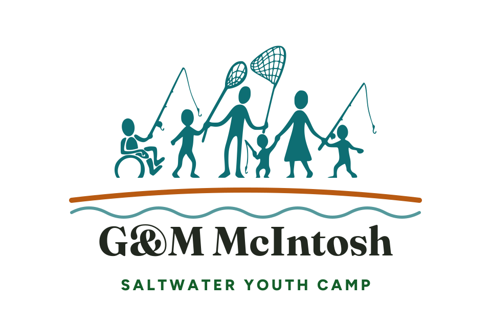
Kate said "Saltwater Youth Camp is in mint green when that one's on dark" and asked if we could "also make it that blue." Only the small words under the name change. On a dark screen they turn from mint to the family's blue; on a light screen they are dark green now, so the change barely shows there. The close-ups below make the words larger.
Kate, after seeing it: "I really like the blue on the saltwater logo a lot better than the green."
Light screen
Dark screen
Close-up of the small words, dark screen
Close-up of the small words, light screen
D. Hope Chest in capitals, and a new line
Kate loves the people in the heart. The capital H beside the heart looks odd to her, so her idea is all capitals at the same letter height. She also wondered about "material needs" in place of "clothing and needs". Pick either or both: D1 for capitals, D2 for the new line.
Light screen
Dark screen
E. Amplify Hope as one piece
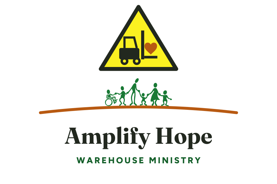
To Kate, the sign, the family and the name feel stacked rather than one logo. Her idea: a much bigger triangle with the family inside it. The forklift, the family and the name stay their current size; only the sign grows. This is a rough sketch.
She felt the 7th Mile Farm logo looks a little stacked too, but did not suggest a change for it.
Light screen
Dark screen
F. A more grown-up handwriting
The site's handwritten notes use a font called Caveat. Kate gets why it feels like camp, but it reminds her of Comic Sans. Her idea: something more mature. Here is one, Kalam, at the same size.
Kate, after seeing it: "I like the font a ton."
Light screen
Four days that last for years
For your review
Four days that last for years
For your review
Dark screen
Four days that last for years
For your review
Four days that last for years
For your review